How to Add Hand Drawn Vector Arrows to Your Website

Step 1: Locate your HTML file
Either locate your own existing HTML source file or create a new file for just for the purposes of this tutorial, using the sample code below:
<!doctype html>
<html lang="en">
	<head>
		<meta charset="utf-8">
		<title>Hand Drawn Arrows</title>
		<style>
			.box {
				background: #f6f6f6;
				font: bold 2em/2.5em "Helvetica Neue", Arial, Helvetica, Geneva, sans-serif;
				line-height: 9em;
				border-radius: 30px;
				text-align: center;
				vertical-align: middle;
				width: 400px;
				height: 300px;
				margin: 50px auto;
			}
		</style>
	</head>
	<body>
		<div class="box target">
			Look at me
		</div>
	</body>
</html>
Step 2: Download the arrows
 Download and unzip our hand drawn vector arrows package, then locate the SVG folder and move the whole folder to the same location as your HTML source file. If you are working remotely, this means uploading the folder to your web server.
Step 3: Choose your target
This can be almost any element on an existing page, ideally a block or inline-block element, whether it is a <div>, <section>, <header> or something else. Open your source HTML file and locate the element you want the arrow to point at and add the 'target' class to it. If you are using the sample HTML this is already done.Step 5: Add the arrow element
Add a new <div> element for the arrow, within your target element. This can be right before the closing tag of the target element. For example with the sample HTML it would look like:<div class="box target"> Look at me <div class="arrow"></div> </div>
Step 4: Prepare the target element
The .target element should be a block or inline-block element and needs to have ideally position: relative, or if the element already has or requires position: absolute then you can leave it as it is and it will still work. Add the following CSS code in between the <style> and </style> tags or to your CSS file.
.target {
	display: block;
	position: relative;
}
Step 5: Add the arrow styles
In your CSS, add the .arrow class and define the following styles:
.arrow {
	position: absolute;
	background: url(SVG/arrow-13.svg) no-repeat;
	width: 135px;
	height: 86px;
	top: 100px;
	right: -160px;
}
I have chosen arrow-13.svg for this example and entered the width and height as 135 and 86 pixels respectively. You can find the width and height values of any arrow by opening the .svg file in a code editor and looking at the viewbox values (in order the values are X, Y, W, H):
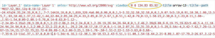 We can of course round these values to the nearest pixel. And we can also scale the svg if desired by proportionally increasing or decreasing both the width and height values in the CSS.
The top and right values decide where the arrow will be positioned in relation to the target element. You will almost definitely need to tweak these unless you are using the demo code. You can also use right and/or bottom values instead.
For example to place the arrow on the left instead, replace right: -160px with left: -160px
We can of course round these values to the nearest pixel. And we can also scale the svg if desired by proportionally increasing or decreasing both the width and height values in the CSS.
The top and right values decide where the arrow will be positioned in relation to the target element. You will almost definitely need to tweak these unless you are using the demo code. You can also use right and/or bottom values instead.
For example to place the arrow on the left instead, replace right: -160px with left: -160px
Step 6: Rotating the arrow
If you are using the demo code provided as-is, you will notice that the arrow is currently pointing the wrong way. But we can fix this by using CSS to rotate the arrow. Add these styles to the .arrow class in your CSS.-webkit-transform: rotate(180deg); -moz-transform: rotate(180deg); -ms-transform: rotate(180deg); -o-transform: rotate(180deg); transform: rotate(180deg);
Result & Demo
That's all there is to it, you now have a scalable vector arrow pointing at your target element. See the demo and get the source code below:See the Pen yajzaQ by Tony Thomas (@medialoot) on CodePen.
<!doctype html>
<html lang="en">
	<head>
		<meta charset="utf-8">
Want More?
Get curated design picks delivered straight to your inbox